Department of Statistics
Graduate Programs
We offer two distinct programs of study for our graduate students. We also offer two additional dual degrees that can be obtained in conjunction with a degree in Statistics.

Undergraduate Programs
The statistics program provides students with a strong foundation in statistics and the broad skills to prepare them for advanced study in statistics or employment in industry and government.

Online Programs
Choose the online Applied Statistics Graduate Program that fulfills your goals. Penn State World Campus offers both an online master's degree and a graduate certificate in applied statistics.


Statistics Up to Date

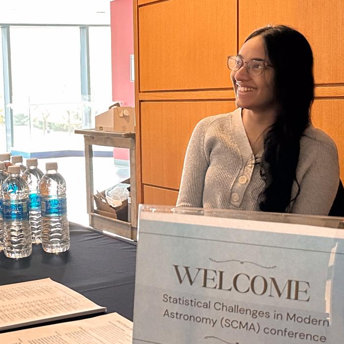
Penn State doctoral student Alina Kuvelkar recently served as a teaching assistant for the 18th Summer School in Statistics for Astronomers.

Penn State statistician Xiang Zhu studies the genetics of heart disease in diverse populations to improve heart health for everyone.


Lecture Series
Distinguished Lectures
Weekly Talks and Upcoming Events
Department Links
The Statistical Consulting Center
The SCC provides statistical advise and support for Penn State researchers, members of industry and government in the areas of: Research Planning, Design of Experiments and Survey Sampling, Statistical Modeling and Analysis, Analysis Results Interpretation, Advice

CTSI Consulting Center
CTSI Biostatistics, Epidemiology and Research Design Center offers one-stop service for researchers who need study design, biostatistical and data management expertise. We provide Penn State researchers with a full range of biostatistical expertise and service.

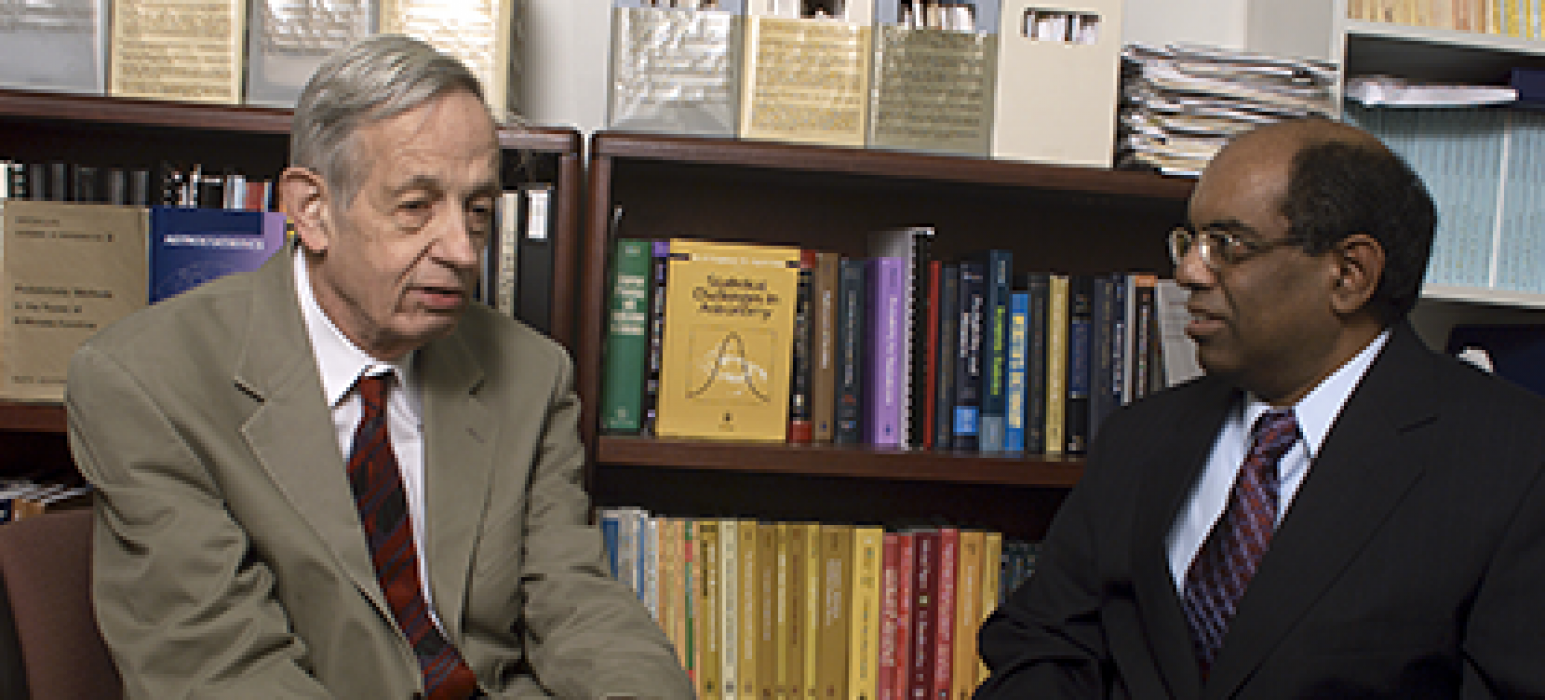
Center for Astrostatistics
The Center serves as a crossroads where researchers at the interfaces between statistics, data analysis, astronomy, space and observational physics collaborate, develop and share methodologies, and together prepare the next generation of researchers.

-
April 25, 9:30 am - April 25, 12:00 pm
-
April 25, 6:30 pm - April 25, 7:30 pm
-
April 26, 9:30 am - April 26, 12:00 pm